Compare Different Types of Stock Charts and Their Uses
July 31, 2026 · 13 min read

When you compare different types of stock charts and their uses, you quickly realize that no single chart is “best” — each one is a lens built for a specific job. A long-term investor tracking a decade of returns needs a completely different visual tool than a day trader scalping five-minute breakouts. Whether you're screening tickers on Finviz or building a full technical workflow, understanding how line, bar, candlestick, Heikin-Ashi, and point & figure charts differ will directly improve how fast and how accurately you read the market.
This guide breaks down each major chart type, explains exactly when it shines, and shows how to compare different types of stock charts and their uses so you can match the right chart to the right strategy — instead of defaulting to whatever your platform loads first.
TL;DR — The Bottom Line
Line charts are best for spotting long-term trends and comparing multiple tickers with minimal noise. Bar (OHLC) charts give traders full price-range data with an objective, low-bias view. Candlestick charts are the go-to for day and swing traders because they combine open-high-low-close data with intuitive pattern signals. Heikin-Ashi charts smooth out volatility for trend-followers, while point & figure charts strip out time entirely to highlight pure support and resistance. The right choice always depends on your holding period, and platforms like Finviz let you toggle between these views quickly during screening.
Quick Facts
- Most common chart for active trading: Candlestick charts, favored by the majority of day and swing traders
- Chart type showing full OHLC data: Bar charts and candlestick charts
- Chart type that ignores time entirely: Point & figure charts
- Best chart for reducing whipsaw noise: Heikin-Ashi
- Simplest chart for beginners and reports: Line charts
- Origin of candlestick charting: 18th-century Japanese rice trading, popularized in the West in the 1990s
Why You Need to Compare Different Types of Stock Charts and Their Uses
Every chart type encodes the same raw data — open, high, low, close, and volume — but displays it differently. That difference matters enormously. A trader who only ever looks at a line chart will miss intraday volatility spikes, gap-ups, and reversal candles. An investor who obsesses over candlestick patterns on a five-year chart is often reading noise, not signal. This is exactly why professionals compare different types of stock charts and their uses before deciding which one belongs on their screen for a given task.
According to technical analysis education from the CMT Association, chart selection should be driven by time horizon first, and indicator or pattern preference second.1 In other words, the question isn't "which chart is best" — it's "best for what." A swing trader holding positions for one to three weeks needs different information density than a retirement investor rebalancing quarterly.
No. Each chart type prioritizes different information — trend clarity, volatility range, or pattern recognition — so the "best" chart depends entirely on your trading or investing timeframe and strategy.
Line Charts: Best for Long-Term Trend Analysis
A line chart connects a series of closing prices with a single continuous line. It ignores the open, high, and low for each period, which sounds like a limitation but is actually its greatest strength for certain use cases.
What Line Charts Show
Line charts plot only the closing price at each interval — daily, weekly, or monthly — creating a smooth, uncluttered view of where a stock has been. There's no visual noise from intraday spikes or wicks.
Best Uses for Line Charts
- Long-term investors who care about the overall trajectory of a stock, ETF, or index over months or years.
- Comparative analysis — overlaying multiple tickers or sector ETFs on one chart to see relative performance at a glance.
- Presentations and reports where clarity matters more than granular detail.
- Quick screener overviews, similar to the mini-charts shown next to tickers on Finviz's screener results, where a fast visual trend check matters more than candle-by-candle detail.
When you compare different types of stock charts and their uses for a buy-and-hold portfolio, the line chart usually wins because it removes distracting short-term fluctuations and lets the dominant trend speak for itself.
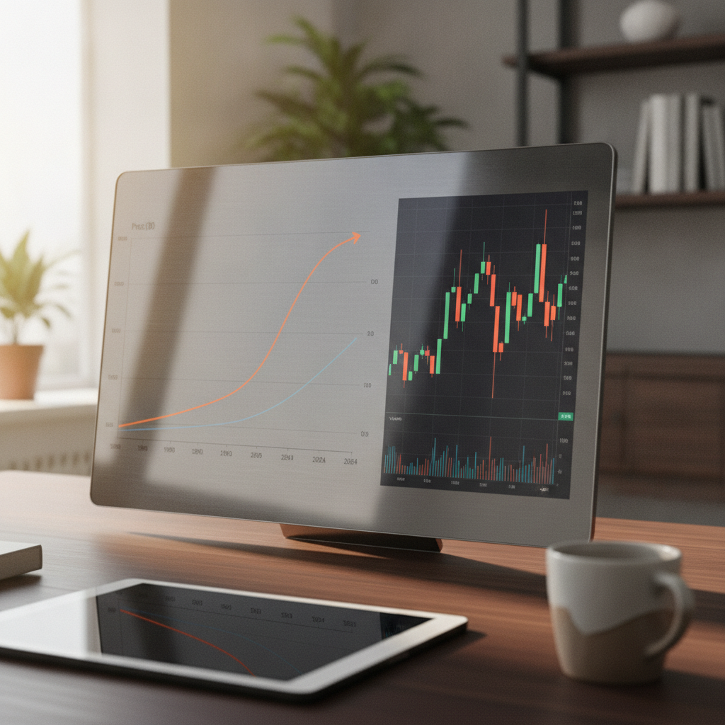
Bar (OHLC) Charts: Precision for Volatility and Range
Bar charts, also called OHLC charts, plot a vertical bar for each period representing the full trading range, with small tick marks on the left (open) and right (close).
What Bar Charts Show
Unlike line charts, bar charts display all four key data points: open, high, low, and close. The height of the bar shows the range between the high and low, giving a precise read on volatility.
Best Uses for Bar Charts
- Technical traders who want full OHLC detail but prefer a less visually "loud" format than candlesticks.
- Volatility and range analysis — bar charts make it easy to spot range expansion or contraction, which often precedes breakouts.
- Gap analysis, since the open tick clearly shows whether a stock gapped up or down from the prior close.
Some veteran analysts prefer bar charts specifically because they feel less influenced by the color-coded bullish/bearish bias that candlesticks can create, making them a more "neutral" tool for objective range analysis. This is a subtle but important point when you compare different types of stock charts and their uses for unbiased volatility reading.
Candlestick Charts: The Trader's Go-To Chart Type
Candlestick charts originated with 18th-century Japanese rice traders and were popularized in Western markets in the 1990s through the work of technical analyst Steve Nison.2 Today they're the default chart type on most trading platforms, including Finviz's individual stock pages.
What Candlestick Charts Show
Each "candle" has a body (the range between open and close) and wicks or shadows (the high and low for that period). The body is typically colored — green or white for a bullish close, red or black for a bearish close — allowing traders to read sentiment instantly.
Best Uses for Candlestick Charts
- Day traders and swing traders who need to read momentum and sentiment shifts quickly across short timeframes.
- Pattern-based technical analysis — dojis, engulfing patterns, hammers, and shooting stars all rely on candlestick formations to signal potential reversals or continuations.
- Support and resistance identification, since candle wicks often mark rejection points that line or bar charts obscure.
Because candlesticks pack open, high, low, close, and directional sentiment into one visual, they remain the most information-dense option when you compare different types of stock charts and their uses for active trading decisions.
Candlestick charts combine full OHLC data with an immediate visual read on bullish or bearish sentiment through color and body size, which speeds up pattern recognition during fast-moving intraday sessions.
Heikin-Ashi Charts: Smoothing Trends for Swing Traders
Heikin-Ashi, meaning "average bar" in Japanese, is a modified candlestick technique that recalculates open and close values using averaged price data from the current and previous periods.
What Heikin-Ashi Charts Show
Instead of plotting raw OHLC data, Heikin-Ashi candles smooth out short-term noise, producing longer strings of same-colored candles during sustained trends and fewer, more meaningful color changes at potential reversal points.
Best Uses for Heikin-Ashi Charts
- Trend-following swing and position traders who want to stay in a trade longer without getting shaken out by normal price noise.
- Volatile markets where standard candlesticks flip color too frequently to give a clean trend read.
- Trailing stop strategies, since a change in Heikin-Ashi candle color can act as a lagging but reliable trend-exhaustion signal.
The trade-off: Heikin-Ashi values are synthetic averages, not actual traded prices, so they're unsuitable for precise entry or exit timing. Most experienced traders pair a Heikin-Ashi chart for trend context with a standard candlestick chart for execution — a good example of why you should compare different types of stock charts and their uses rather than relying on just one.
Point & Figure Charts: Removing Time and Noise
Point & figure (P&F) charts are among the oldest charting techniques still in use, and they take a fundamentally different approach: they ignore time completely.
What Point & Figure Charts Show
P&F charts plot columns of X's (rising prices) and O's (falling prices), with a new column started only when price reverses by a predefined amount (the "reversal size"). Periods with no meaningful price movement simply aren't plotted at all, regardless of how much time passes.
Best Uses for Point & Figure Charts
- Support and resistance mapping — because minor fluctuations are filtered out, P&F charts highlight only significant price levels.
- Long-term trend and breakout traders who want to cut through sideways chop and focus purely on directional conviction.
- Price target projection, using the horizontal count method, a technique P&F analysts have used for decades to estimate potential move sizes.
P&F charts are less commonly used by retail traders today, but analysts who specialize in classical technical analysis still cite them as one of the clearest ways to compare different types of stock charts and their uses when the goal is filtering noise from long-term structural levels.
Comparing Different Types of Stock Charts and Their Uses by Trading Style
The table below summarizes how each chart type stacks up so you can quickly compare different types of stock charts and their uses side by side.
| Chart Type | Data Shown | Best For | Main Limitation |
|---|---|---|---|
| Line Chart | Closing prices only | Long-term investors, multi-ticker comparisons | Hides intraperiod volatility |
| Bar (OHLC) Chart | Open, high, low, close | Objective range and volatility analysis | Harder to read at a glance than candlesticks |
| Candlestick Chart | Open, high, low, close, sentiment via color | Day and swing trading, pattern recognition | Can look cluttered with many indicators |
| Heikin-Ashi Chart | Smoothed/averaged OHLC | Trend-following, reducing whipsaw | Synthetic prices, not exact for execution |
| Point & Figure Chart | Price only, no time axis | Support/resistance mapping, breakout confirmation | Less intuitive, loses time context |
A useful rule of thumb: the shorter your holding period, the more OHLC detail you need — which is why day traders lean candlestick and long-term investors lean line charts.
How to Choose the Right Chart Type on Finviz
Rather than picking one chart type forever, most successful traders switch between two or three depending on the task at hand. Here's a simple process to follow:
- Define your timeframe first. Are you holding for years, weeks, or hours? This determines whether you start with a line chart, a Heikin-Ashi chart, or a standard candlestick chart.
- Screen broadly with simple visuals. Use Finviz's screener to scan sector performance and ticker trends quickly using clean, low-noise chart views before drilling down.
- Switch to candlesticks for entry timing. Once you've shortlisted a stock, pull up its detailed candlestick chart to study recent price action, volume, and pattern formations.
- Add a bar or Heikin-Ashi overlay for confirmation. Cross-check volatility (bar chart) or trend persistence (Heikin-Ashi) before committing to a trade.
- Revisit your chart choice regularly. As a position matures from a new idea into a long-term holding, it's normal to switch back to a line chart for tracking, not timing.
This layered approach is the practical answer to how professionals compare different types of stock charts and their uses in a real workflow rather than in theory.
Yes, and many experienced traders do. A common workflow uses a line or Heikin-Ashi chart to confirm the broader trend, then switches to a candlestick chart for precise entry and exit timing.
Common Mistakes When Comparing Stock Chart Types
Even experienced market participants fall into a few predictable traps when they compare different types of stock charts and their uses:
- Using candlestick pattern rules on a weekly or monthly line chart mindset. Patterns designed for short-term candlestick analysis don't translate cleanly to long-term line-chart trend calls.
- Treating Heikin-Ashi values as real prices when setting stop-loss or limit orders — always confirm exact price levels on a standard chart before executing.
- Ignoring volume alongside any chart type. Volume context is essential regardless of whether you're reading a line, bar, or candlestick chart.
- Overloading a single chart with too many chart-type-specific indicators, which defeats the purpose of choosing a cleaner format like a line or bar chart in the first place.
Frequently Asked Questions
What is the best stock chart type for beginners?
Line charts are generally best for beginners because they show a single, uncluttered trend line based on closing prices, making it easy to understand overall direction before moving on to more detailed formats like candlesticks.
Which chart type do professional day traders use most often?
Most professional day traders use candlestick charts because they display full open-high-low-close data along with an intuitive color-coded read on bullish or bearish sentiment, which is critical for fast intraday decisions.
Are Heikin-Ashi charts more accurate than candlestick charts?
Neither is more "accurate" — Heikin-Ashi charts smooth price data to reduce noise and clarify trend direction, but the values are averaged and synthetic, so standard candlestick charts remain more reliable for exact entry and exit prices.
Why do point & figure charts ignore time?
Point & figure charts are designed purely around price movement, plotting new columns only when price reverses by a set amount. This removes time-based noise so analysts can focus on significant support, resistance, and breakout levels.
How often should I switch between chart types?
There's no fixed rule, but many traders switch chart types at each stage of research — using simple line or Heikin-Ashi views for screening and trend confirmation, then candlestick or bar charts for precise entry and exit timing.
Final Thoughts
There is no universal winner when you compare different types of stock charts and their uses — only the right tool for your specific timeframe and strategy. Long-term investors benefit most from the clarity of line charts, active traders rely on the detail and pattern recognition candlesticks provide, volatility-focused analysts favor bar charts, trend-followers lean on Heikin-Ashi, and classical technicians still find value in point & figure structure. The skill isn't memorizing one chart type — it's knowing when to switch.
Ready to put this into practice? Head to Finviz and toggle between chart types on any ticker to see firsthand how each one reframes the same price data — then build a research workflow that matches your trading style, not just your habits.
Sources: 1. CMT Association, "Technical Analysis Body of Knowledge," https://cmtassociation.org — 2. Nison, Steve, "Japanese Candlestick Charting Techniques," New York Institute of Finance, referenced via Investopedia, https://www.investopedia.com/terms/c/candlestick.asp